I bought the feathers, the yarn flowers and the woodgrain/vintage frames from here. The price is great, and the shipping not so bad either. And it didn't take long to come. And they didn't get all banged up in the mail...I hate when that happens!
Everything is printed on thick cardstock, with quality ink, so no worries there.
So now, you just cut your stuff out.
And do your thing...
BONUS TECHNIQUE: covering up an ugly corner. My hubby didn't take a lot of pictures at my sister's wedding last month. And some of the ones I have aren't the best. But I really like this one of me walking down the "aisle". It felt like I had a mile to walk and this kind of gives you an idea of that. Unfortunately, you can see the DJ set up, and an ugly red chair. But if I crop the photo down, it just isn't the same.
So I covered it up with some pretty feathers and chipboard and a flower! You can still see most of the frame, but now you can't see the chair or table. Try this the next time you have a "trouble photo" instead of pulling out the scissors.
The big frame goes nicely around my wallet print, and the smaller frame provides a little extra embellishment at the top.
The background was created using lots of Glimmer Mist over top of a Jenni Bowlin chipboard shape. Then I removed the shape.
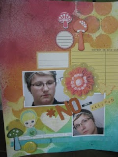
On this next layout I'm using the yarn flowers. I vaguely remember making these when I was a young'un with those little plastic looms! It's hard to believe that this is a one-dimensional shape printed on paper! You can actually see the shadow of the yarn! I have a hard time with most digital stuff because it looks fake...you can tell right away that it's a digital image. But this stuff is so real looking!
I even used the little doll that comes on the package. Danielle really loves Blythe dolls, so they are sort of her "logo". The package that my papers came in had a trio of dolls printed on the face. So I cut out the most Lisa-looking one and stuck her down. The jewel on her shirt is Prima.
the complete layout:
Just some fun pictures I took around Halloween. The "Boys" sign on my door is an actual bathroom sign from a school that was razed by my grandma's old place. Me and my sister dug through the rubble and I found this gem! It works well as part of my title!It's really fun to use digital and regular embellishments together on the same layout. The combination of flat and puffy is really fun, and the extra colour and texture never hurt nobody!
I hope you enjoyed the "Technique" this week! I had a lot of fun playing with my Kitschy Digitals & Goods.
I totally recommend checking out some digital or hybrid scrapbooking products. Sometimes you can find things that just don't exist in a traditional scrapbooking store. And the fact that you get a file to keep on your computer and use forever and ever...hey I love that! And a lot of stuff out there now can be altered - colour, size, texture - if you have the right software. If you're new to digital scrapbooking, most sites that sell the stuff have classes or tutorials you can use to practice and become more familiar with the products.
And I am so not comfortable scrapbooking on the computer, but this felt like traditional scrapbooking, with a new technique and that's that!
next week: Projects with Postcards...I'm so excited!! see you then!


No comments:
Post a Comment